A damask with a fox peeking out of the scrollwork. A blue-and-white toile where, on closer look, the shepherds are riding bicycles. Traditional wallcovering with a whimsical turn keeps the grammar of the classics and lets one joke loose inside it.
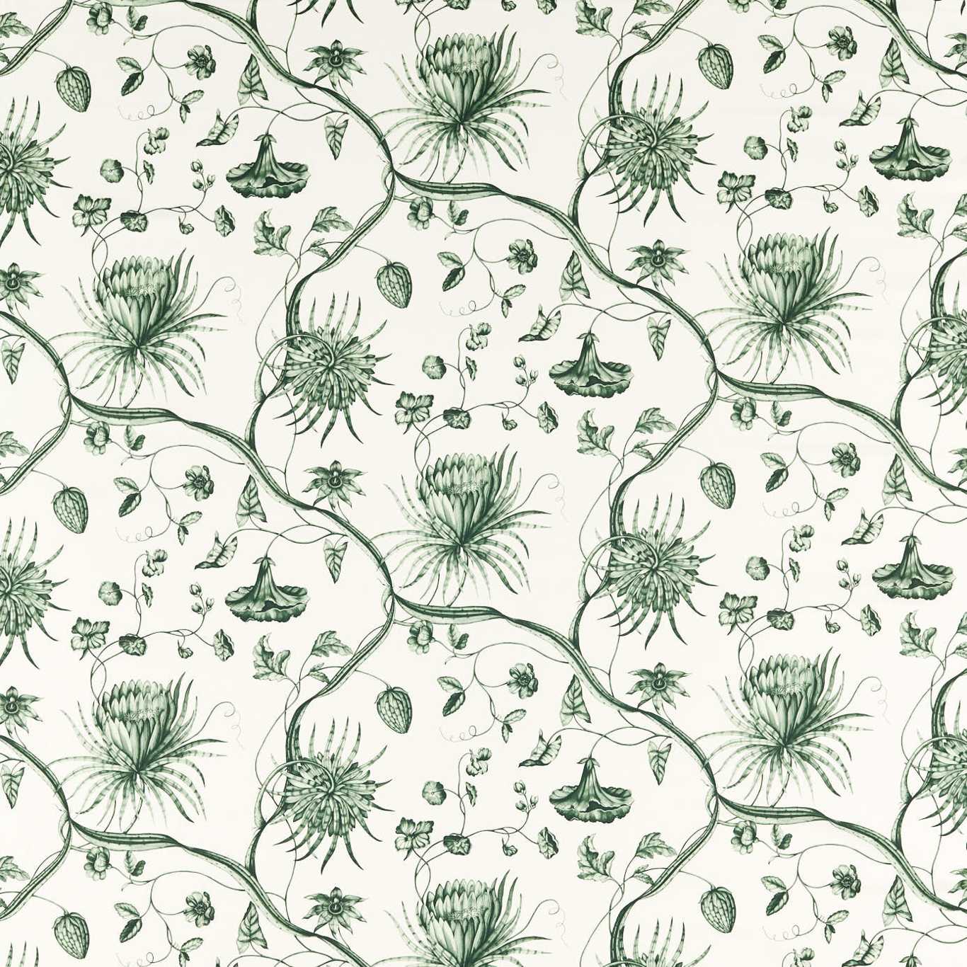
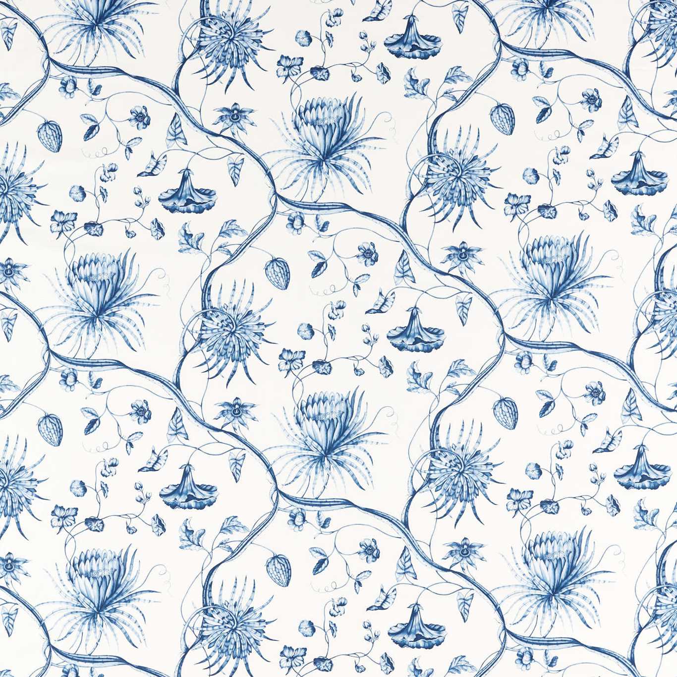
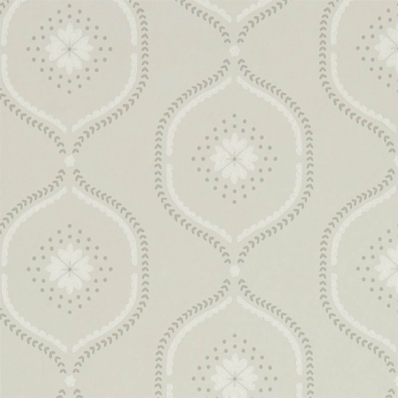
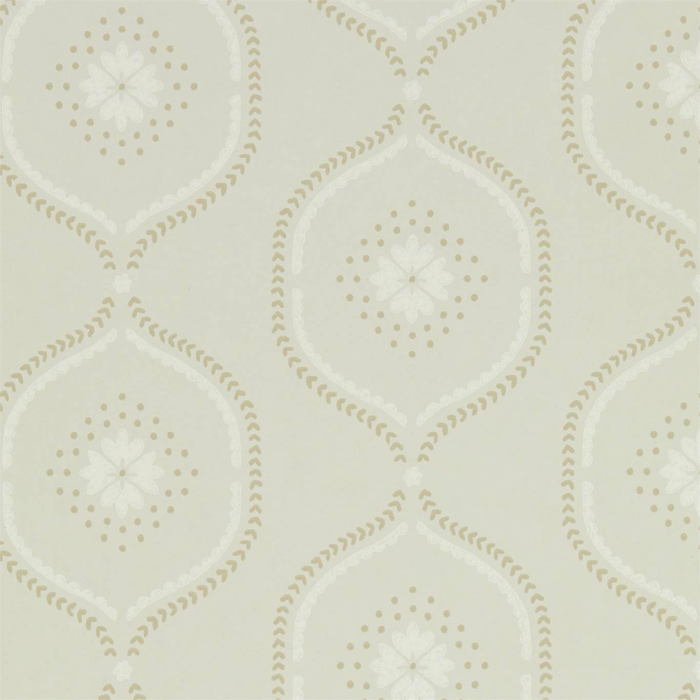
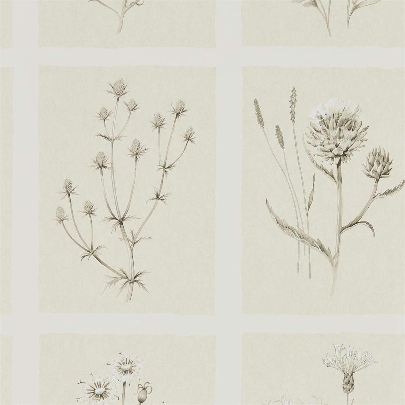
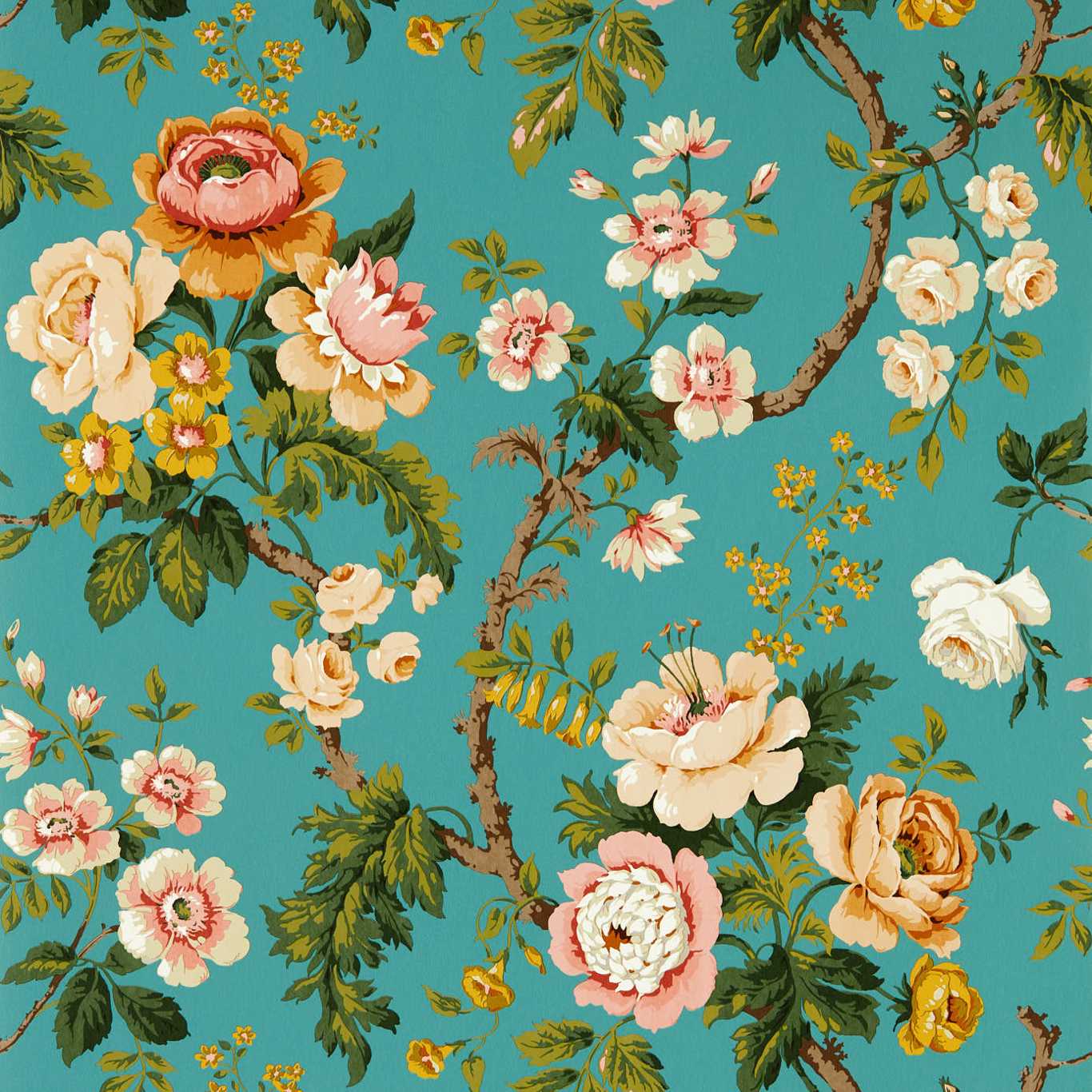
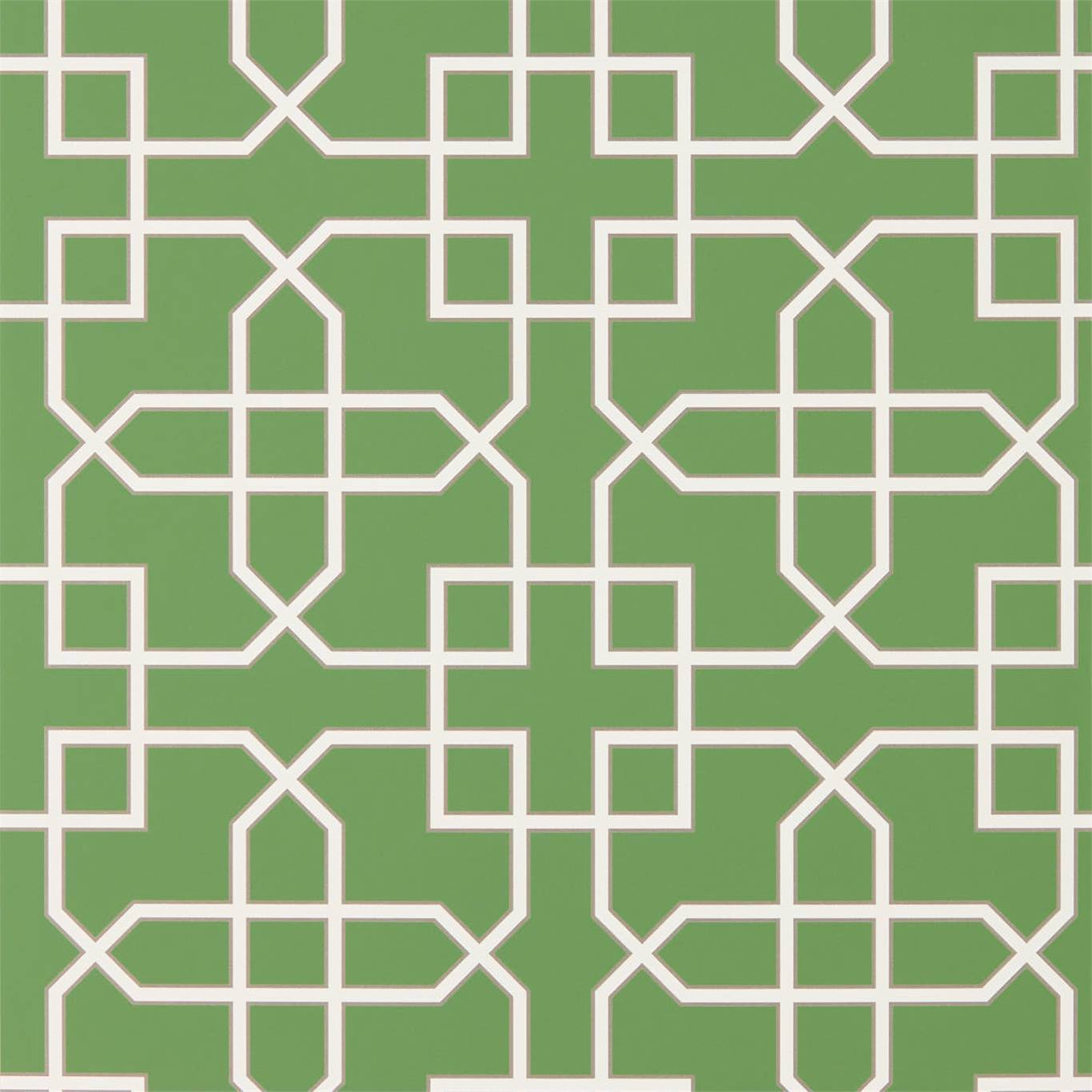
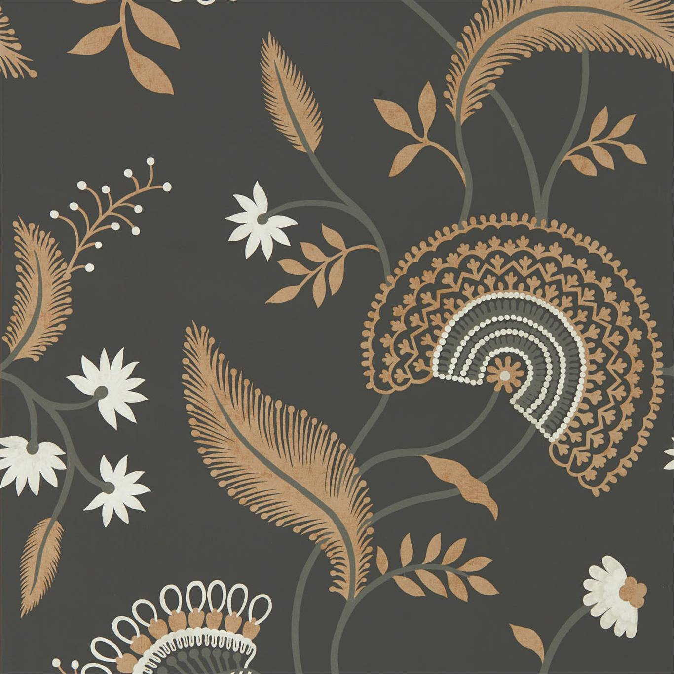
The classics are the straight man
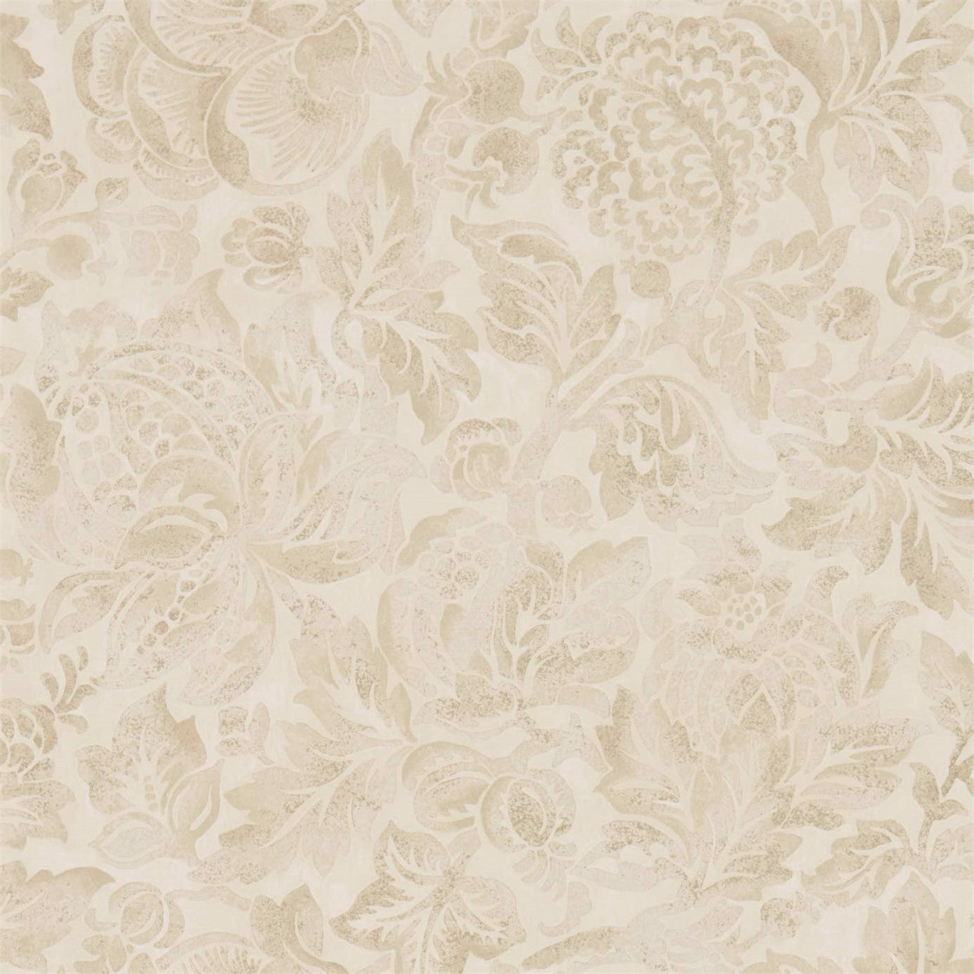
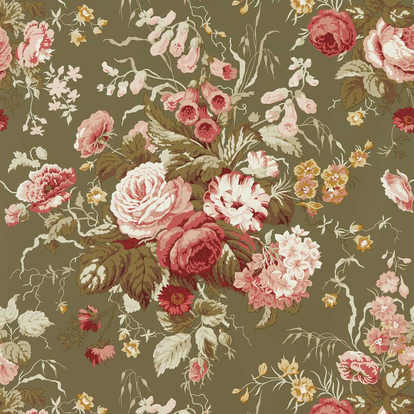
Whimsy only lands when the surrounding structure is played completely straight. Traditional wallcovering gives you that structure: the mirrored symmetry of a damask, the pastoral vignettes of a toile, the tight botanical trellis of a chintz. These patterns carry centuries of expectation, and the eye relaxes into their order. That relaxation is exactly what a well-placed surprise plays against, which is why the whimsical version of a classic reads as witty rather than merely busy.
The move is to change one variable and hold the rest. Keep a toile's monochrome palette and copperplate line but swap the pastoral scene for something modern or absurd. Keep a damask's perfect vertical mirror but let an animal or an odd object inhabit the negative space. The pattern still hangs like a traditional paper across a whole wall, so the room reads as classic from the doorway and rewards the guest who steps closer.
Where to hang the joke
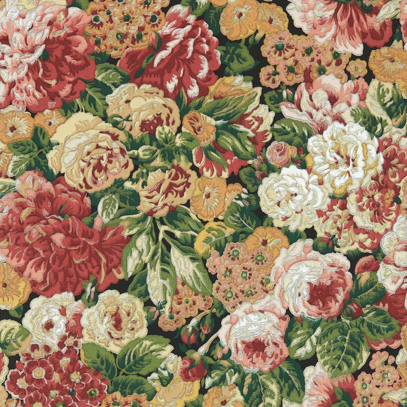
Whimsical traditional papers are perfect for the rooms where a little delight is welcome and the stakes are low: a powder room, an entry, the back of a bookcase, a child's room that the child will outgrow into rather than out of. A powder room is the classic home for it because the guest is alone with the wall for a few minutes and has time to find the secret in the pattern, which is half the pleasure. The small footprint also makes a bolder, denser design feel like a jewel box rather than an assault.
In larger rooms, use the whimsical paper as an accent against restraint. A single papered wall or a papered ceiling, with the other surfaces in a quiet traditional color, lets the pattern be the wit of the room without exhausting it. The rule of thumb from classic decorating still applies: one thing gets to be loud, and here you are simply letting the loud thing also be funny.
Palette keeps it grown-up
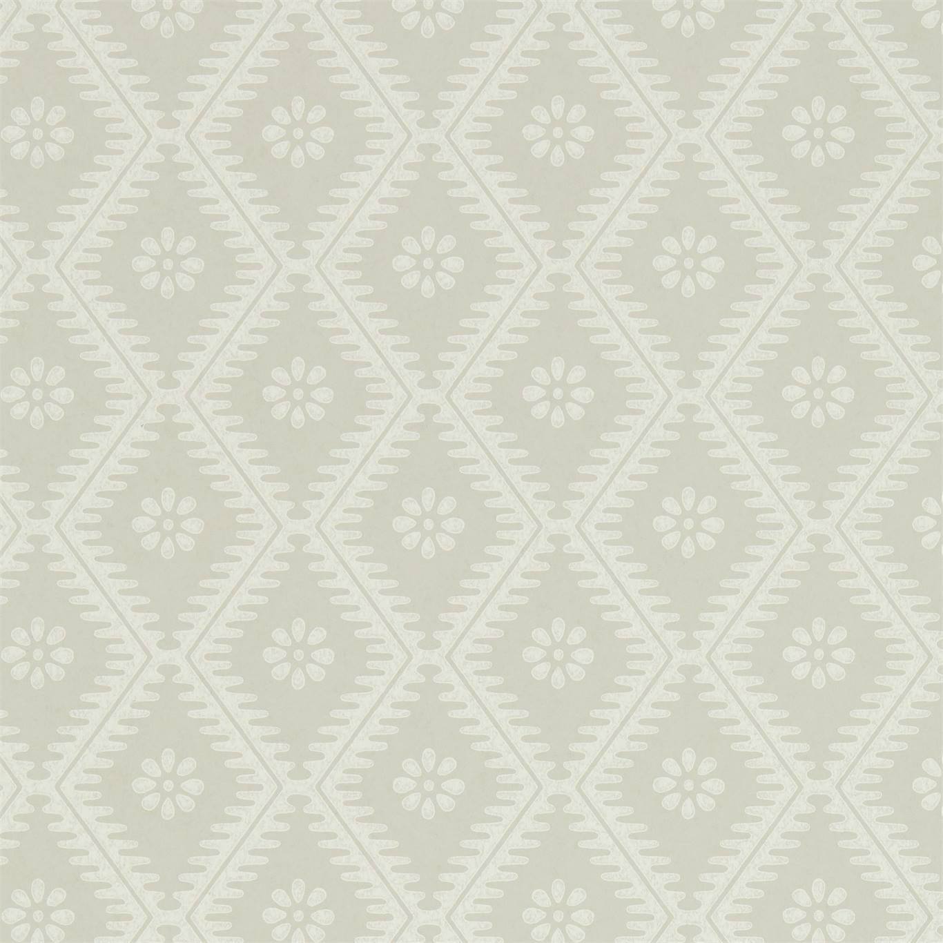
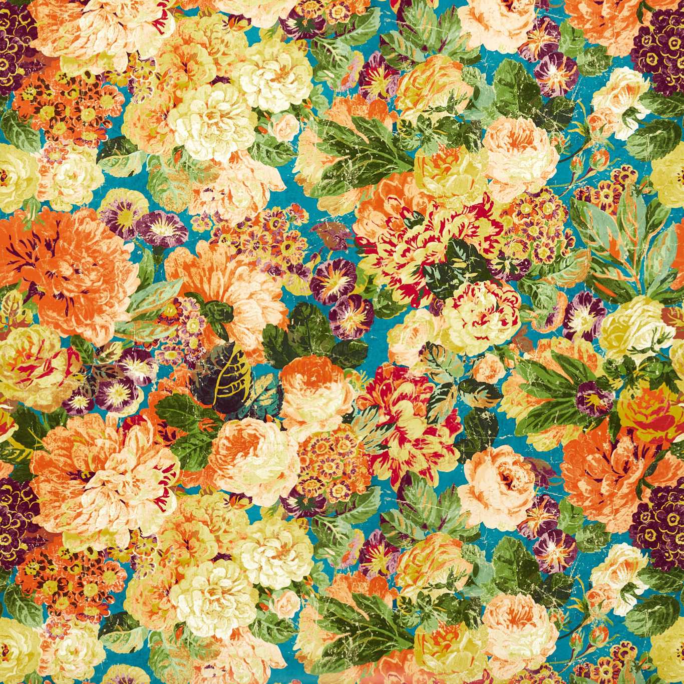
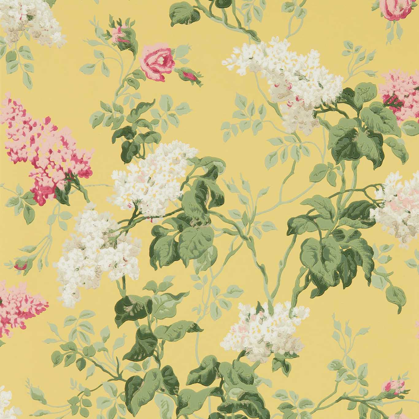
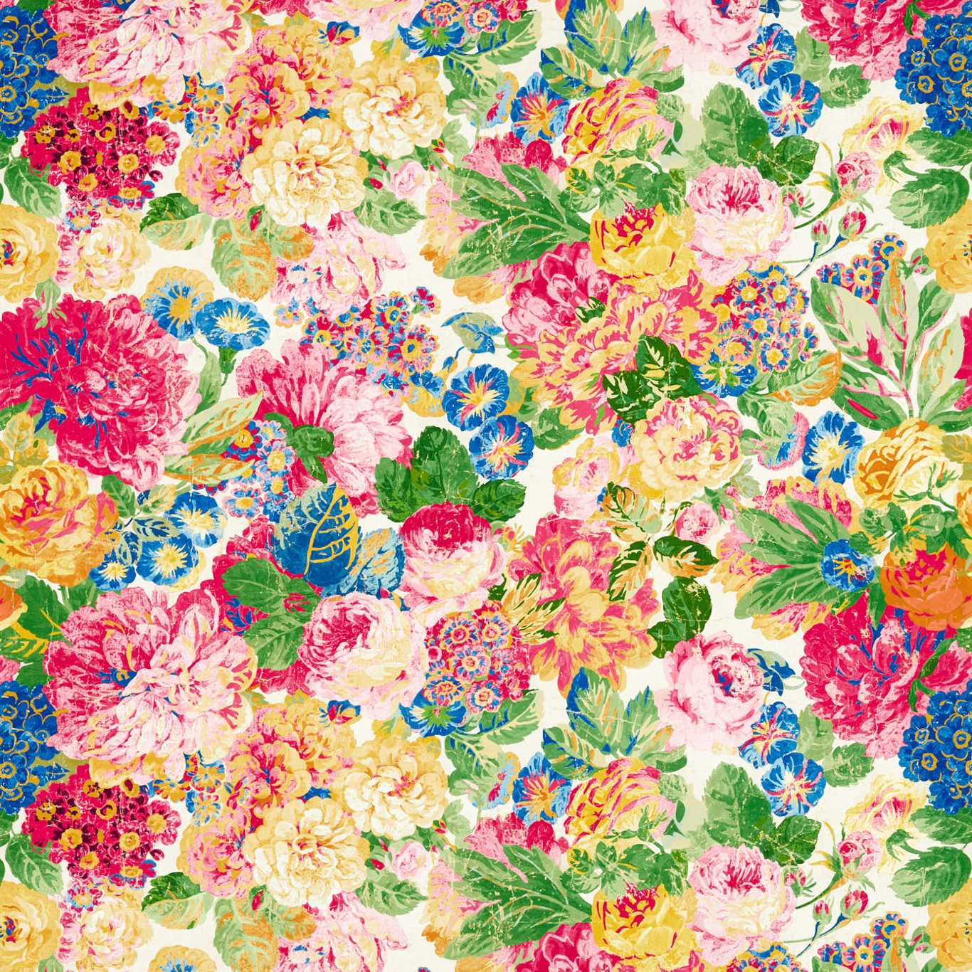
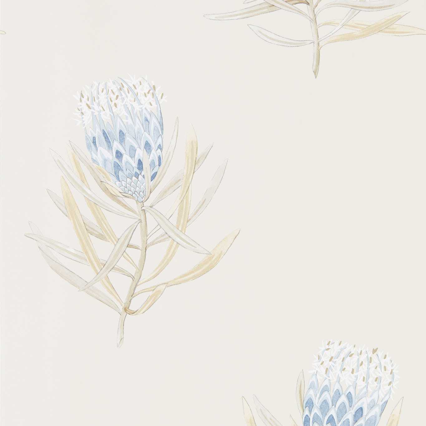
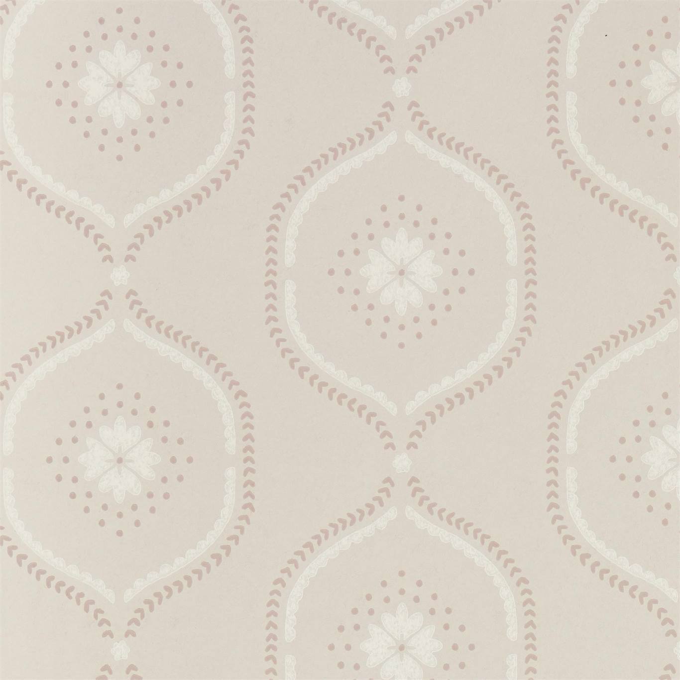
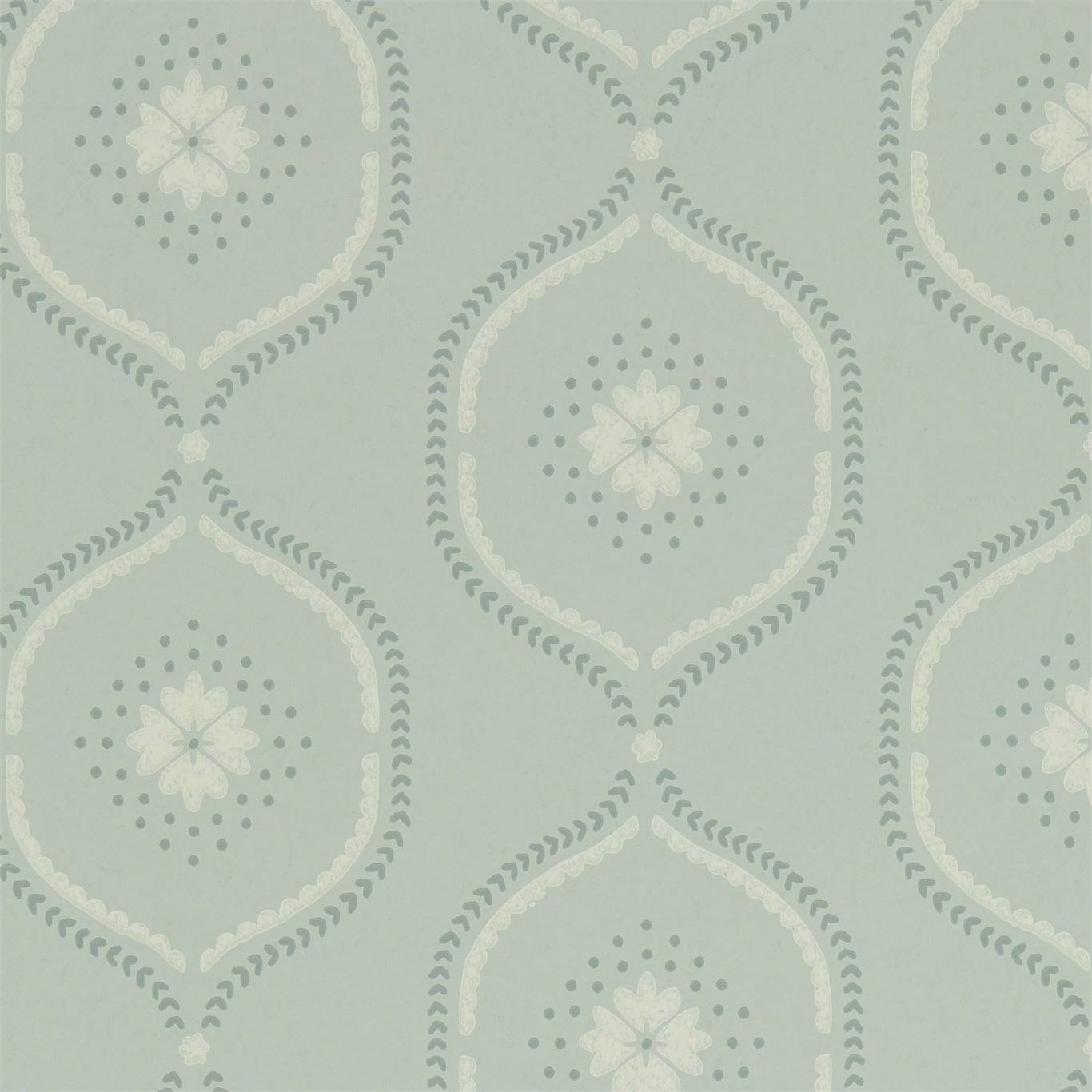
The difference between whimsical and childish is almost always the palette. Render a playful motif in the muted, slightly grayed colors of traditional decorating — soft celadon, faded rose, ochre, ink blue on cream — and it reads as a sophisticated wink. Render the same motif in bright primaries and it reads as a nursery. Because the underlying pattern is a classic form, holding to a heritage color story is what keeps a grown-up room from tipping into cartoon.
Sheen and ground help too. A chalky matte finish and an antiqued, slightly warm ground give even an eccentric pattern the patina of something that has always been there, as if you inherited a very odd but very tasteful paper. That sense of age is what lets the whimsy feel confident rather than trendy, and it is what makes these papers pair so easily with real antiques and traditional upholstery.
Quick checklist before you order
- One variableChange a single element of a classic pattern and keep everything else traditional.
- Small rooms firstPowder rooms, entries, and bookcase backs reward a bolder, denser whimsical design.
- Heritage paletteMuted, grayed classic colors keep a playful motif grown-up rather than childish.
- Antiqued groundA warm, chalky ground gives eccentric patterns the patina of something inherited.
- One loud wallIn big rooms, use the witty paper as an accent against quiet traditional neighbors.
Frequently asked
What makes a traditional wallpaper whimsical instead of just busy?
A whimsical paper keeps a classic structure — a damask, toile, or chintz — and changes just one element, so the surprise reads as a deliberate wink rather than clutter.
Where should I use a whimsical wallpaper?
Powder rooms, entries, ceilings, and the backs of bookcases are ideal, because the guest has time and space to discover the joke without it overwhelming a whole room.
How do I keep a playful pattern from looking childish?
Use a muted, heritage palette and a warm, chalky ground; bright primaries tip a playful motif into nursery territory, while grayed classic colors keep it sophisticated.
Read more
- Toile de Jouy, from Oberkampf's pastorals to a Harlem sceneThe monochrome pastoral pattern that started at Jouy-en-Josas in 1760, and the modern designers who kept the format and swapped the story.
- Damask at the wrong scale is the whole jokeA pattern born in the silk looms of Damascus reads as pure formality until you blow it up, flatten it, or recolor it. Scale and color do the subversion.
- Singerie: the monkey business inside chinoiserieThe eighteenth-century fashion for painting monkeys aping human life gave a formal genre its comic streak. Christophe Huet's Chantilly rooms are the template.
- Decorating with a wink: the one-gesture rule for playful classicsA whimsical traditional pattern works when the rest of the room stays disciplined. Anchor it, limit it to one move, and keep the palette honest.